
Interactive 3D chart experiment
Bringing fresh perspective to the TTF Value-at-Risk analytical model

It is the dog days of summer, half the world is at the beach and the other half wishes they were too. I am firmly between the two camps, working slightly reduced hours and catching up on lots of overdue admin between visits to friends and family.
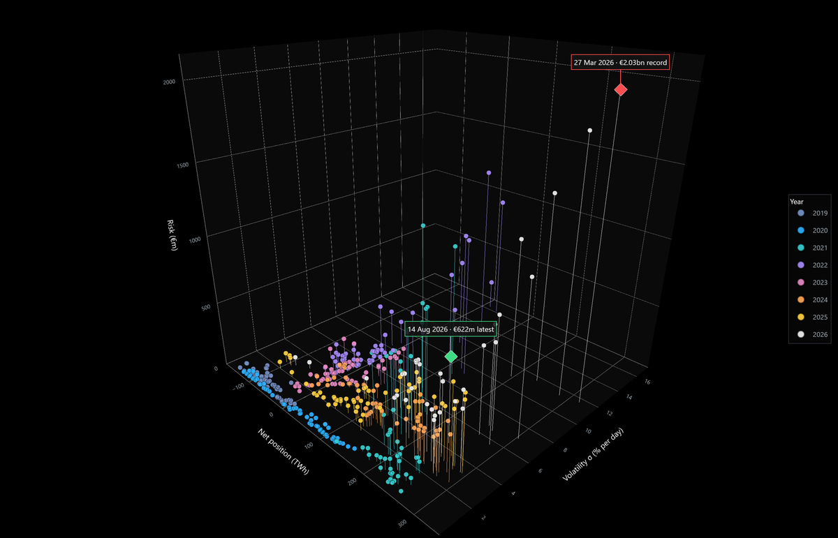
This means there is no full Chart Deck this week or next. But I do have something new to share: interactive 3D charts that bring a fresh perspective to the Value-at-Risk (VaR) analytical model I’ve been developing in recent months.
Both are live on the site because they won’t render via email, so you will need to click through and log in. You can spin, zoom, hover over any week and read the numbers off (note: this post is free to read, but the interactive chart elements are visible only to paid subscribers).
Here’s what each one does:

✍️ Sign up for free to continue reading...

Member discussion: Interactive 3D chart experiment
Read what members are saying. Subscribe to join the conversation.